In the Biesboschen …

In the Biesboschen
Four hundred begettings ago,
Hunting, fishing and gathering
We people followed the narrow under-tree paths
of deer and swine.

Otter-Wijf might then have been my name.
Hung with bones, herbs and a wisert’s skin
I walked and walked and walked the cool under-tree paths
Of our home range.

— — — —

With this painting and poem I’ve tried to manifest a dream in which I had the clearest sensation that I walked through sand–making those little squeaks–in an ancient Dutch setting. Otter-wijf was my name and I wore a leather shoulder bag with dried herbs in it, and a leather wrap about my shoulders.

It was the uncanniest thing when I woke, no longer wearing the wrap or the bag when only seconds before they felt as real, as the bed-sheets a few seconds later.

Painting Over A Collage

My painting of the week is nowhere near done. Credible mountains, white snow, a melting glacier and refections in the lake at the base are the objectives, so far anyway.

An unusual start has made several of the objectives quite hard to achieve. While painting with water colours paper towels and or paper tissues are vital for mopping up spills or too much water/paint.

So you get patterns on these used scraps that are too good to just throw. I glued a bunch of such in my A4 art notes book, using some 50% acrylic varnish I happened to have standing around.

When thoroughly dry, I started painting. I used gouache for the snow and will probably regret that. Could’ve used water colour ground. Some parts of the reflections are looking good. Everything in the foreground needs greying down.

The long steep rocky slope into the water is of course a wrong reflection, can’t be helped. By me, anyway. The boulder and its reflection need toning down a bit but the way the water ripples just there … I like very much!

Doing this painting I’m reminded again that keeping a scrap of paper to dab on all the colours I’m using, for a record, would’ve been a good idea. But I forgot. Never mind, I shall wing it.

‘Spatter and Spray’

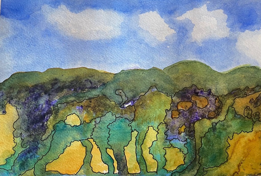
… is a way of painting with watercolors, I’ve discovered. And I’m in the throes of experimenting using the technique.

First came across it on Susan Cornelis’s blog. https://susancornelis.wordpress.com/wp-content/uploads/2025/03/googleeye.jpg

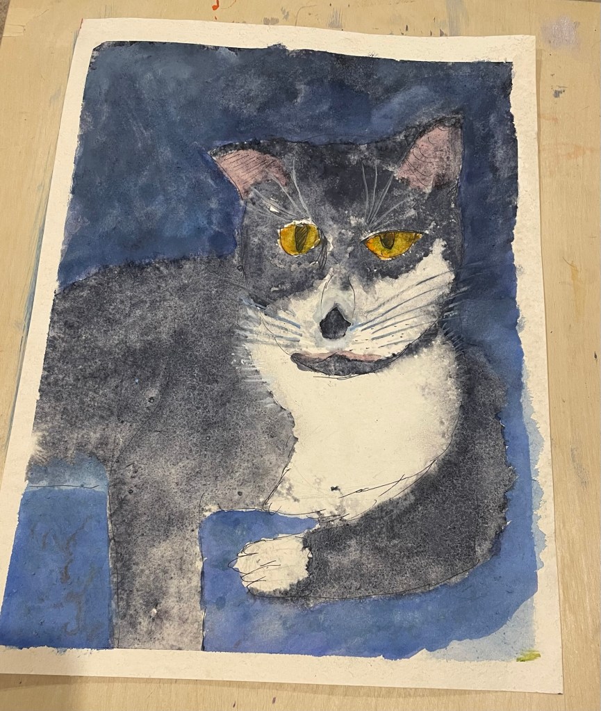
So I’ve fallen in love with granulating paints. My first effort was Miss Tabitha…

Ordered a couple more tubes of granulating paint and washed out a fine spray bottle originally used for a deodorant.

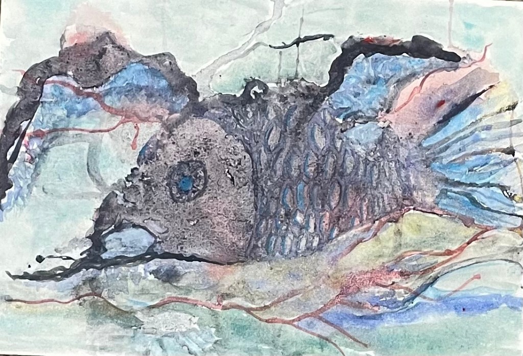
Second, this fish. I call it a bottom feeder, but may rename it … I’m having so much trouble getting this from my mobile … might have to do magic. Like, abracadabra … OK I’ve got it. Ended up saving it to the desktop … isn’t she beautiful? A spatter and spray painting barely touched up. Well, OK, I painted the scales. The rest is dabbed. Not yet sealed.

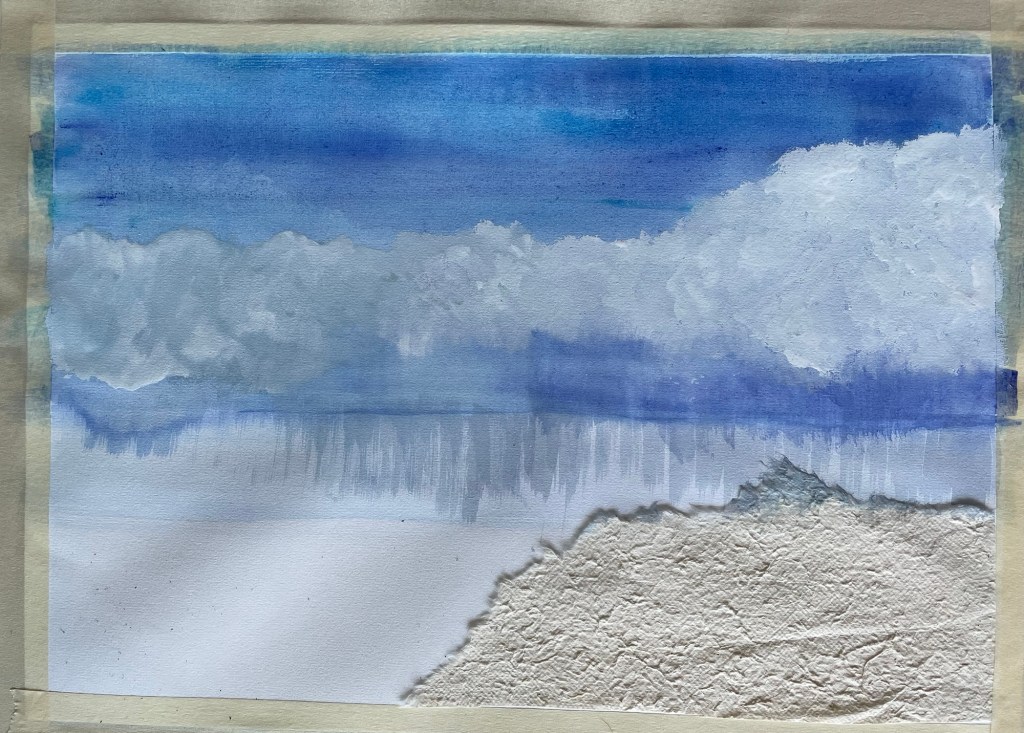
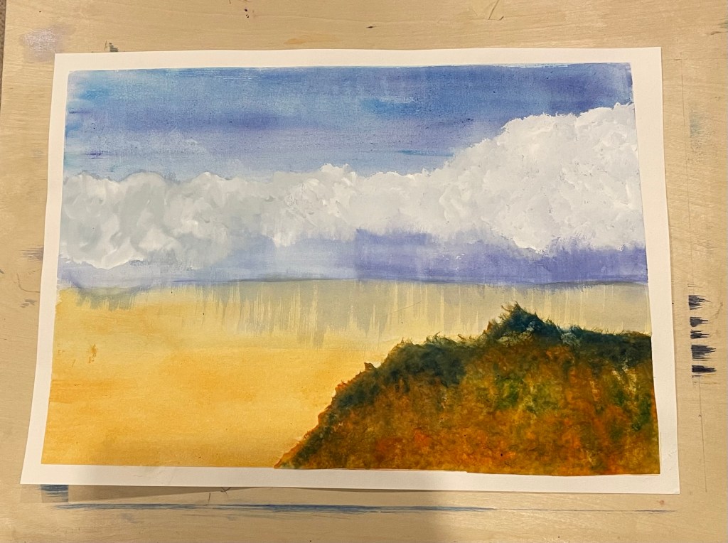
This is the top half of my third effort. I’ll tentatively call it The Aviatrix. The bottom half of this painting is still a problem. one thing is for sure, I’m learning a lot about gouache.

It’s hard to believe what you can get from spattering paint onto the paper then spraying it with water. But that’s only the first layer. You let it dry, then the next day, if the pattern you have doesn’t yet suggest anything to you, you do it again. Like I did with this one. The third day, this aviatrix lay there waiting for me. I painted some of the areas to increase that likeness and here she is.

The bottom half of her face needed work of a different sort. After my efforts first with gesso, then with gouache that’s still in the thought-pan, and another post.

As well as the spatter and spray technique, I’m experimenting with sealing my watercolor paintings with an acrylic varnish. I hate the look of paintings behind glass or the whole process of framing. Miss Tabitha has been varnished and the look is good.

And plus, I don’t have enough wall space to hang everything I paint. Nor will I foist amateurish experiments on my nearest and dearest. So, most must be stored. Varnishing them seems like a good option.

The varnish I’m using is water-based so easy to cut. A mixture of 25% acrylic varnish in 75% water seems to be working pretty well. Ideally this should be sprayed on but since I’m still only experimenting, I’m laying the varnish on the painting with a watercolor mop brush. A time-consuming procedure but the only one I can afford at the moment.

Indigo

Indigo by Daniel Smith is probably the watercolor I use most, and is also my favorite to experiment with … if that makes sense. This indigo is so finely milled it’s the smoothest paint I own and yet it’s capable of amazing gymnastics. Below a wet layer of indigo over a failed experiment (which is represented by the pink tones) with phthalo blue dropped into it.

The Indigo, being smooth and light (weight) allows granulars such as sodalite, and heavier colors such as phthalo blue, to react spectacularly.

Getting shades by dipping a brush into water after a stroke, indigo will last longer than any other color and make the most wonderful greys.

One of the newsletters I subscribe to is Books on Books curated by Robert Bolick (https://books-on-books.com/2025/03/23/books-on-books-collection-louis-luthi/)

This month’s letter took me to a link (https://sites.rutgers.edu/motley-emblem/indigo/) where I discovered some interesting facts about indigo. So far about 200 plants have been discovered that yield indigo, and it is nearly the only color-fast natural plant dye.

The two hundred plants is quite a surprise as the Japanese indigo cloths are quite expensive and said to be made from a rare plant. Several cultures in Africa also use indigo to dye cloths. I’m wondering now whether the original processes make these products expensive, there is bound to be a lot of processing necessary to make dyes from scratch.

My only experience extracting color from wild plant materials to dye wool, has been using lichens to make a dark red, and that was by boiling the lichen and the yarn in ammonia, then setting the pot in a sunny place for three weeks, stirring it daily. Reading how indigo was/is extracted, it seems a similar process.

Following the links, the Brooklyn Museum webpage presented me with Catherine McKinley’s article on indigo’s influence in women’s culture, where Indigo is spoke of as rare … as in “the rare, refulgent dye and the commodities spun from it.” from (https://www.brooklynmuseum.org/stories uncovering_a_womens_history_of_african_indigo) while Bloomsbury Press offered me one of McKinley’s resulting books https://www.bloomsbury.com/us/indigo-9781608195886/

In Asia, cultures such as Javanese batiks and ikats, and Japanese aizome also made indigo famous.

Nowadays ammonia is one of my no-no’s in that I’m allergic to everything with chlorine in it, though fabric dyeing has remained one of my interests. It was only a small hop to watercolor painting on cotton paper.

Wikipedia’s article on indigo, in particular growing the plant https://en.wikipedia.org/wiki/Indigofera_tinctoria

Been Painting…

All paintings are multiple experiments.

A3 size paper … could I sketch my cat and have it come out realistic? Her head is too long, has to be rounder next time

Could I use grainy paint and make that represent fur? sort of.

Could I make her eyes seem to look at the observer? Negative on that so far.

Could I tie the background together using a gesso glaze? Glaze too thick, blotted out the detail. Cat is sitting on a blue couch. Can’t really see that.

The original technique of spray and paint didn’t work all that well, need a better spray/misting bottle.

Other than those points I’m pretty happy with it.

Watercolor Painting

For the last week or so I’ve been busy intermittently with my latest painting. A3 size, part of an ongoing learning curve. Can count the number of successful A3s I’ve done on one hand.

I wanted to use a collaged element, some textured paper that I’ve had for about 25 years.

A mix of French Ultramarine and Phthalo blue for the sky, clouded with gouache white going into grey. The headland unadorned in situ weirdly looks inset, rather than glued on top.

Headland and sand flats painted with Quinaquidrone Gold, headland in addition with Phthalo blue (green shade). Beautiful rich colors, but the sandflats too bright, too gold.

Left it a couple of days. Toyed with collaging an old building in the lower left. Read John Lovett’s website about ‘distressing’. Found a bristle brush. What he recommends for distressing.

Scary stuff to actually do it.

The big middle area painting every which way with grey made of the previous colours and a smidgen of Alazirin Red.

The dark diagonal area running down from the middle was the only problem. After trying to stare it gone for a couple of days, I wet it and mopped up excess paint. Repeated as required. At the same time disappeared the slumped bit of the horizon.

Then the gate. Something in the foreground is a way of getting depth. And that worked. it’s hard to get a good photo. For instance there’s no hill in the left of the picture. That line is much less obvious.

But, OK, I’m happy with if.