Weird Angles

Sometimes an unusual angle of a familiar place throws out your or in this case my familiarity with a place.

This must be a view of the place where I live, in one of the three buildings in the background of this view. There are a lot of bits on it that I just don’t recognise.

The buildings in front are the back of the Harvey and Norman Plaza, I know that for sure.

Behind them as the crow flies … well I see them but I don’t recognise them. Not that I particularly love their architectural style—it’s a case of what can be done to box up 3 x 95 home units economically—I am interested in how the built environment can be situated in the landscape.

In this part of Brisbane, residential multi-storeys are being shoe-horned among areas of older style single family residences on a block of land, the many parks and, it seems to me, the many commercial and retail plazas.

The way inner Brisbane is transforming is totally different from the way the outer Sydney suburbs transformed during the time I lived in Berowra, in what were then the northern outskirts of Sydney.

I’m going to have to try to circle the so called village and photograph it from all angles.

For the photo above I stood in Carindale Park on the cricket ground somwhere. I can see I’ll even need to record where I stand.
Water color-painting .. practice

Learning a craft takes a lot of practice. When I was stil pretty new to watercolor painting, I used to try to paint on any type of paper and thin cardboard.

Not all of it worked. Art calendars featuring photographic art have a lot of marble dust in them. Paint sits on top until it dries. Made for some interesting experiments.

Then for a while I used mixed media papers, they worked better and I still have a few of those paintings.

Lately I’ve gone into 200 gsm paper specifically made for watercolor and since I have a problem throwing out good things that might be useful one day, I swear I’ve hung onto every bit of used 200gsm paper I’ve painted, it seems like.

Of course I laugh at myself but then don’t throw anything, I have a bag full of painted scraps for collaging.

Recently I’ve felt the need to practise painting a ‘wash’ or ten. Something I have a lot of difficulty with. So ended up with ten washes on four sides.

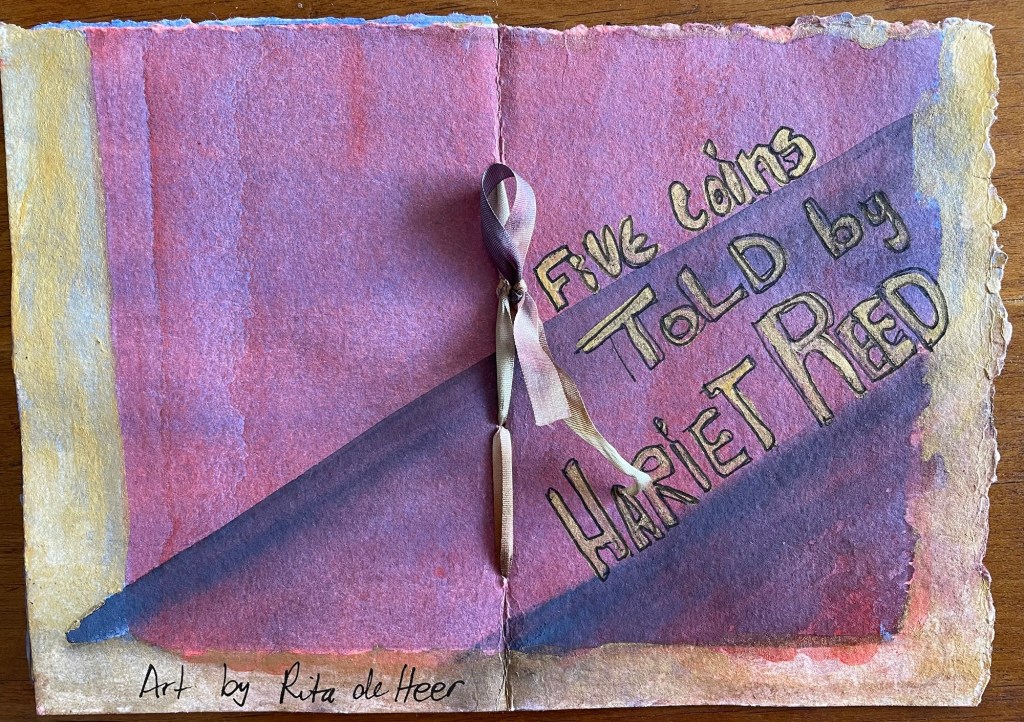
Made them into a little art zine … if I have that terminology right. Here the back and front covers (three washes)

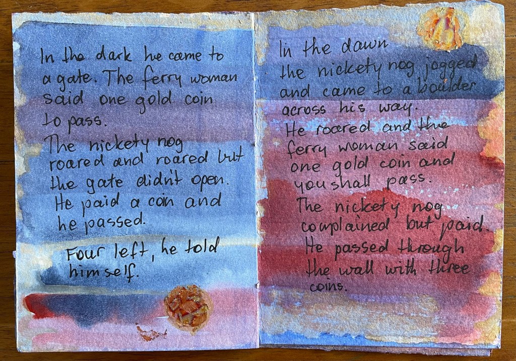
The story was going to be about a red planet but the nickety nog said No!

Several aspects about this booklet please me quite a lot. The size, a quarter of an A4 page. It’s just enough for a short fairy story. I like the way the torn edges of the pages look edged with gold.

‘Hariet Reed’ is a pen name scrambled from my real name. Good for the witch telling this story. I don’t like the stickers much, will rethink that aspect. The random design of the pages (all those washes) worked well.

The story became a dark in color as wel as plot little tale about a nickety nog demanding a five and after being offered various juicy morsels and rejecting them, stealing five gold coins.

The story lacks cohesion, there are a couple of glitches, as well as other things I could’ve done better. The gold coins for example.

Some of the coins are gold-leaf on pva glue, none of them turned out round and some were rounded later with acrylic paint. And then towards the end I thought might as well paint the whole coin with acrylic gold. Worked the best of the lot.

All useful things to remember for when I make the next little story book. Only the last two pages were over-painted to help the tale end.

Gone to Feed the Fish

The unfortunate vertical ripples, which barely show when I’m looking at it with only my specs between my eyes and the painting, are due to a paper working well above its pay-grade.

I’m trying to finish my stock of less than ideal ‘parchments’ before I acquire more.

You’re right if you think that this painting seems pretty well unintelligible seen from a distance. Zooming-in helps. It’s always surprising when and what meanings can be wrung from a few splotches, and unplanned application of color, and a few well-chosen words.

Art: Evercool by GC Myers

One of the many suppressed longings of creation which cry after fulfilment is for neglected joys within reach; while we are busy pursuing chimerical …

Evercool

This morning found another artist whose paintings ‘speak’ to me. Simple at first glance with well defined shapes. The colours, how I also like to outline them.

But complex, too. Layers signified by tree branches in front and behind. The road topping hills and going out of sight in the dales. Thetr is distance and perspective.

And there’s luscious substance, not to forget. Shapes shadowed as they curve inward to meet the bedrock of the canvas.

I like it a lot.

New Page … Art Stories

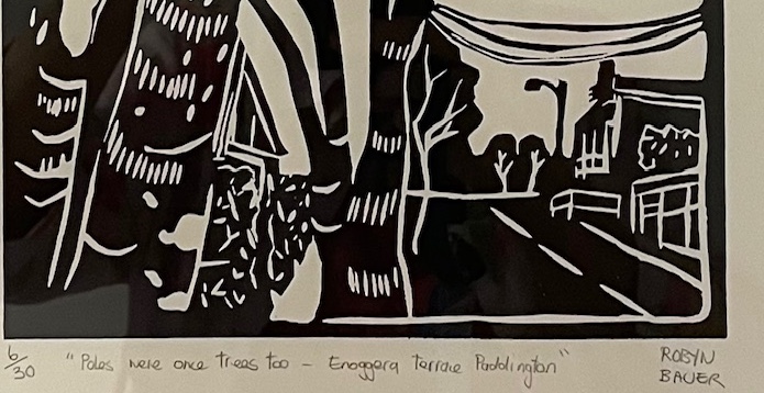
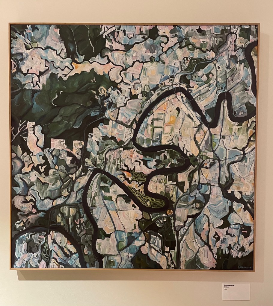
Due to so much good art on the walls everywhere here where I am now living … such as this print by Emma Nancarrow Brisbane [not dated], I’ve been wondering how I could record and share? This work hangs near the elevators.

This is it.

A Page dedicated to celebrating the paintings, prints, lino cuts, photos and experimental visual media in the public areas of this community.

Now to connect this to that. I used to know how to do that. This will do it in the meantime … https://ritadeheer385131918.blog/art-stories/