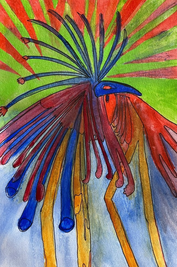
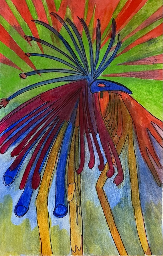
The minute I painted a 25% strength hi gloss acrylic glaze over these stilt dancers, to see what would happen, this became my test painting.
The glossiness of the glaze was cut right back I was glad to discover. The suggestion to glaze came from johnlovett.com …. I may have said before that I’m not keen on framing pictures behind glass.
I have a couple of paintings on the go where I’m scared to touch the good stuff with more water, and so destroy them. though they bothneed more work. What to do?
Got the test painting out. Touched up cartain areas with acrylic paints. Let them dry overnight. Did it work? Did the acrylics rub off? Yes for the first question. No for the second.
The dark red fronds were overpainted with acrylics. The deep gold ditto. The greenish base, also. And none of it, upon scratching, comes off.
So, I’m good to go with sealing my Geriatric Aviatrix, and touching up her scarf with acrylics, because touching her up with water color over gouache might be a disaster …
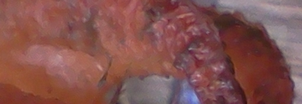
This, what I’m calling a partial of Nalbo’s mangled hand, began its life in a totally different kingdom of life. Have a look for something fungal. Its image, once I’d cut certain pieces away, sort of reminded me of a mangled hand I once did see … a shocking injury … I thought would illustrate Nalbo’s injury nicely.
Learning a craft takes a lot of practice. When I was stil pretty new to watercolor painting, I used to try to paint on any type of paper and thin cardboard.
Not all of it worked. Art calendars featuring photographic art have a lot of marble dust in them. Paint sits on top until it dries. Made for some interesting experiments.
Then for a while I used mixed media papers, they worked better and I still have a few of those paintings.
Lately I’ve gone into 200 gsm paper specifically made for watercolor and since I have a problem throwing out good things that might be useful one day, I swear I’ve hung onto every bit of used 200gsm paper I’ve painted, it seems like.
Of course I laugh at myself but then don’t throw anything, I have a bag full of painted scraps for collaging.
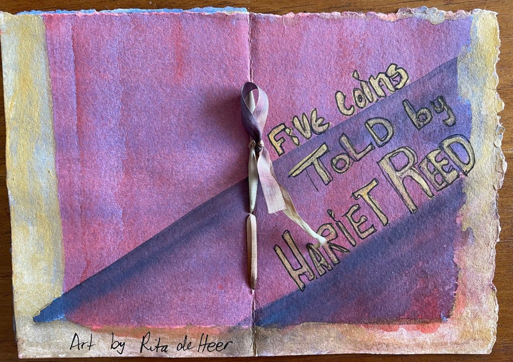
Recently I’ve felt the need to practise painting a ‘wash’ or ten. Something I have a lot of difficulty with. So ended up with ten washes on four sides.
Made them into a little art zine … if I have that terminology right. Here the back and front covers (three washes)
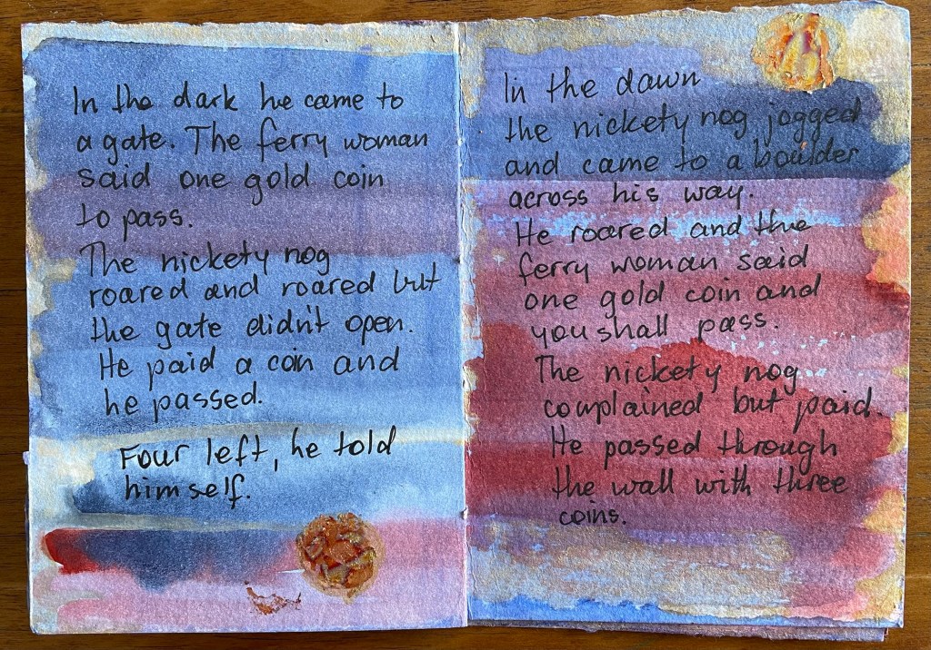
The story was going to be about a red planet but the nickety nog said No!
Several aspects about this booklet please me quite a lot. The size, a quarter of an A4 page. It’s just enough for a short fairy story. I like the way the torn edges of the pages look edged with gold.
‘Hariet Reed’ is a pen name scrambled from my real name. Good for the witch telling this story. I don’t like the stickers much, will rethink that aspect. The random design of the pages (all those washes) worked well.
The story became a dark in color as wel as plot little tale about a nickety nog demanding a five and after being offered various juicy morsels and rejecting them, stealing five gold coins.
The story lacks cohesion, there are a couple of glitches, as well as other things I could’ve done better. The gold coins for example.
Some of the coins are gold-leaf on pva glue, none of them turned out round and some were rounded later with acrylic paint. And then towards the end I thought might as well paint the whole coin with acrylic gold. Worked the best of the lot.
All useful things to remember for when I make the next little story book. Only the last two pages were over-painted to help the tale end.
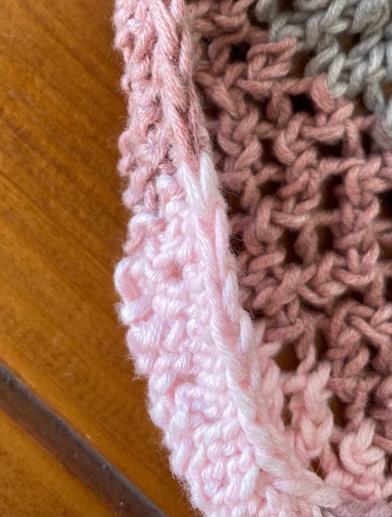
A while ago I started an experimental knit that I intended to serve as a base for a crochet design of leaves and vines.
What happened to that?
This. The rolling up just never resolved itself. The more I knitted the tighter and higher it rolled.
OK, so experienced knitters will be saying I’ve done something wrong and I accept that.
Too tight? Nope, as loose as possible with yarn no thicker than a regular two ply, knitted on 4mm knitting pins.
Weird yarn? Maybe. 60% cotton, 40% viscose. No spring in it. At all.
Wrong stitches? Very possible. Stitches in the body of the work are fine. Loose and drapy as desired.
Increasing at the beginning of each row? The problem has to be there! Ffor the purl, rear of the work, row I increased by sticking pin into back of first loop, knitting that plain, then bringing knitting needle forward to knit a purl and continuing with a purl line.
Did the opposite at the front of the work, making a stitch at the beginning of the row by knitting a purl, yarn to the back then knitting a plain and coninuing in plain.
These made nice edges, one that I’d never seen before on the purl side of a work …
And yet, by the time I’d knitted twenty rows the first five had rolled up. After I unpicked those first five—with difficulty—the next five rolled up as I was doing it.
By sixty rows, the first fifteen had rolled up. No matter how I draped and folded the resulting cloth the bottom rolled up. By the time I’d knitted eighty rows I knew I had a twisted disaster and finished it off.
I may deconstruct it and use the yarn for another project, but this was already the second knit that that yarn featured in. Not sure how well it’ll stand up to the strain of pulling apart again.
I see a warm red and a warm green watercolour reaching out for a 50/50 agreement.
I might be wrong though. The red is warm, I have no doubts on that score. But the green?
Apparently if a green leans to its yellow side on the colour wheel it’s classified as warm. And cool if it leans to the blue side.
Light yellowish green has always seemed greener to me, and so cooler. Blueish green on the other hand, felt richer and lush, and so warmer.
I’m about to do that exercise again using Alazarin Crimson, which leans towards its blue neighbour so is classified as cool, and Hooker’s Green wich also leans to the blue side.
And after that, a second trial with the so-called warm versions of red and green. I assume I’ll need to use a scarlet and green made with a warm blue and a warm yellow.
I expect neither of these exercises to resemble the above but we’ll see what we’ll see.