While I am always on the lookout for art books to interact with, every so often I see/read/hear about a book process or published article with so much promise as well as being very special in itself, I instantly would like to ‘own’ it.
To hold it in my hands. To leaf through it. Turn and turn it about, reading the story from go to woe … which in this story is the reality. To love it, in effect.
Yet this share to my blog will have to do me this time!
What’s a thing you would like to ‘own’ but cannot?
She has a lot of tracks you’ll be saying, and you’re not wrong. This particular track I’ve been on for only about six years and was off for over six to nine months.
This time last year I had a lot of nightmares, so much so that I thought to get some help figuring out why. First saw a dream analyst for about fourteen weeks. Fatigue reared its ugly head. The trip there and back by public transport once a week proved too wearing. I went to once a fortnight, then quit and looked for something online. (I am lucky to have so many good options.)
Found This Jungian Life podcasts and listened non-stop for a few weeks then signed up for their Dream School, Websites at end of the post. So for six months I painted my dreams and studied how to interpret them. That’s still going. The course is twelve months.
But once you’re taking notice, dreams come thick and fast and I only painted a few. Wrote the rest. The journal these days is a loose leaf folder with pages inserted when and where. And notes, because as you learn more previous dreams also suddenly get meaning.
The community committee organizes classes and groups. I joined a painting group. Two people are working in oils. Two in acrylics. The leader asked me what. I went home and fetched my watercolors gear. Painted a little scene.
Ordinary, compared to what came after, and there a few things I would’ve done different if I’d been more aware of what I was doing, and less concerned about where I was doing it. I’ve never painted in public.
Lol, there’s no planning in this landscape at all. I started at the top with the sky which worked OK. All the rest reminds me of the scenery of an early computer game, Robin Hood I seem to remember, forest in clumps suggesting paths where the merry men disappeared. A slope and a lake? River? Ice? That blotty bit in the middle? Was where I was distracted, painting in public as I said, and my brush hit the paper where it shouldn’t have, and I tried to blot off the marks.
Link to both Dream School and the This Jungian Life podcasts. This Jungian Life
Delving Yardbarker’s post about Place on their blog Faded Houses Green, started me thinking about what place has meant to me over the years, and how that affects my story making.
My best childhood places and events resonate in me with bursts of color. My first clear self-remembered memory is of the upturned faces of golden dandelion flowers starring the flooded and frozen grassland where my father took me and my little brothers ice skating. I was about six-years-old and had ‘proper’ child-sized skates. My brothers had flat, double-edged pieces of Meccano strapped under their shoes.
Much further on in the same year there were the glory of dahlias in a three-brick high garden bed in the backyard. A riot of pinks, plum red, orange, and golds that pronged into my eyes and heart so that I was rarely aware of the voracious pigeons sharing the backyard, quarreling over the feed scattered over the patio.
The master bedroom was curtained with a pink-orange tinted cotton. When the afternoon sun shone through, the room glowed red-gold, and I loved to be there then. Roundabout when I turned seven, my mother said that I wasn’t to hover at the bedroom door and make a nuisance of myself. She’d loaned the bedroom to a pair of unmarried teenagers expecting twins, and life became grey and ordinary for a while. Grey skies. Grey streets, red-grey brick houses. Seven dried up leaves on the sapling outside the front door.
One autumn we camped at a place called ‘Ommen’ where golden chanterelle mushrooms grew in the pine and beech forests nearby. My mother took us mushroom hunting and to find the little triangular brown beechnuts that fit exactly between my first three finger tips. Fried together on the primus camp-stove, these ‘fruits of the forest’ made dinner that night a feast.
And so I find that most of my clearest, earliest, visual memories of places are to do with warm vibrant colors. Being given my first orange when I was about eight years old, what a delicious thrill that was. I kept it for days in a special tin under my bed, to take it out and drink in its glory. Hot golden potato fries deliciously fragrant with mayonnaise that we sometimes had from a particular shop in De Haag on the way home from a long trip.
My first Lego set, the size of a packet of cigarettes, that had enough red bricks in it to build a little house, and that because I received it as a going-away present, I will always associate with the ship we traveled on to Indonesia.
Of course there were more colors. Skies of washed-out blue, steel grey or unbroken cloud. The North Sea, when I saw it, was usually also steel grey. River boats were brown or slick grey with rain and river water. The Hoogovens (steelworks) had a tall chimney belching out yellow-grey. Shades of green did not particularly impress me in those childhood days. The saddest book I ever read had covers of dark green leather.
When I look back on those years, it seems now that most people then kept their vibrant colors for indoors. Traditionalists had their rich red Persian rugs as table covers—after a meal they swept crumbs from them using a special stoffer-en-blikje, (dustpan and brush), with brass handles. Needle-worked scatter cushions and cross-stitched wall hangings brightened cosy living rooms. Highly polished brass planters and vases reflected firelight and old fashioned oil lamps.
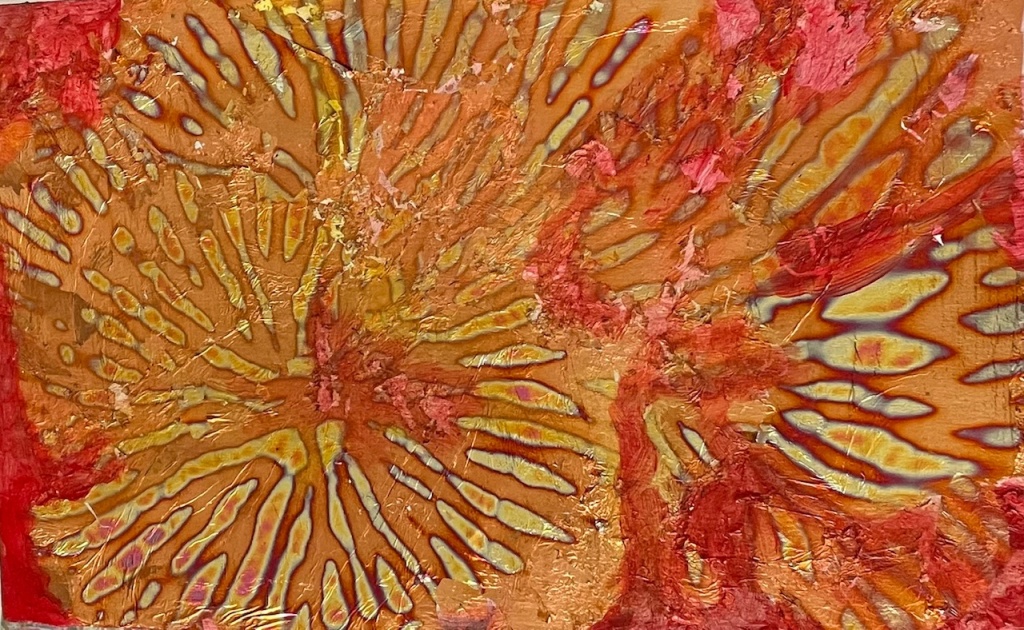
Experiment with watercolor paint and starburst foil
One of my favourite meditative activities is working on the decorated margins in my dream journal.
They are always different and often suggest living creatures, such as here a beaked being on the right, and a fox-like entity in the centre.
The process is simple. I use my water colour paints and a 0.4 Artline 200 pen. Today I used Quinacridone Gold and Scarlet.
Since this book is new and the paper is an unknown quantity, I’m starting with primary colour mixes. I’ve already noticed there’s a vast amount of spotting on this paper. Don’t yet know why.
I painted patches and streaks of the first colour round the margins surrounding the blocks to be saved for writing, and waited till moderately dry.
Sloppily over-painted with second colour, leaving some of the gold patches and streaks, and making new patches and streaks over the first, and any unused areas.
It doesn’t pay to be too exact. Wait until thoroughly dry. Some people use hairdryers to speed the process.
In my next session I use the outliner—I prefer black—to make lines wherever the colours change including in areas of shading, though it’s easy to go too far.
It pays to keep checking how the work looks, and whether any recognizable entities are cropping up, and then to give them an eye or ear.
My semi-abstract representation of an imaginary creature …
Dryad, After the Clear-Felling, Rita de Heer, 2017
Finally I learned the difference between imitation and representation in art. Thank you, Judith. These concepts have been bothering me for quite a while. When I first started to learn to paint with watercolors, I had to relearn everything I knew. About paint, how to apply the paint, how colors work when you overlay them on other colors, and how to represent the subjects I’m interested in.
I can say ‘represent’ with confidence now. I’ve always represented semi-abstract subjects using acrylics, pen, pencil. I’ve made embroidered, macrame and knitted hangings, and used a darkroom to change my photographs.
[I’m telling you, mobile phones are amazing. Can do everything I did then in the dark room, in the comfort of my arm chair, or on the bus. You know what I’m saying.]
Since I got interested in fungi about thirteen years ago, I have flirted with the idea to perhaps practice botanical drawing or painting. That would mean going back to the life drawing classes I studied in a Visual Media strand long ago … the pure art of imitation, copying the subject of study, stroke by pencil stroke, onto the paper.
Lately though I’ve been asking myself whether I’d have the patience for that now. It’d even more like meditation than laying water colors on paper. Not that that’s a bad thing. But am I ready to let go what I’m still learning?
Recently I mentioned the connections between art and philosophy — a branch of study referred to asaesthetics. On this point, which deals with beauty and taste, I’m content to go with the conventional wisdom that says beauty lies in the eye of the beholder. You like what you like. I like what I like. Sometimes we’ll be in agreement as to what is beautiful and note-worthy; at other times we’ll have very different opinions. Still, all is well. We’re each entitled to our opinions.
My study oftonalism, however, has brought me a bit deeper into philosophy and art. I’ve been reading more about the life and work of Asher B. Durand, one of my favorite artists. Several years ago as I first began oil painting, I read Durand’s collection of “Landscape Letters”. While I enjoyed his essays on art, I was beset with questions. I…
Hong Kong Krazy! Original by Melanie Reim of sketchbookseduction.blogspot.com, traced over and copied by Rita de Heer
#inktober2021 Thought I would have a go at this with all the varieties of ink and ways of applying it to paper, I happen to have on hand.
It’s also re-training in fine motor co-ordination and for that reason I began with an ordinary ball point pen tracing an old postcard on Oct 1, and trying to replicate it on Oct 2.
Of course I researched the #Inktober scene after I already began. In the real competition there are topics. The first day was ‘crystal’ and the second day ‘suit’.
Lol, I’m out of it already. Just making it up as I go. If I produce something for the whole 31 days, that will be amazing enough.
This began as a piece of paper I used for practicing leaf shapes with a new brush, using indigo with a bit of yellow top and bottom.
Then, doing this project, I’m recycling paper as I go since everything I do is trial and error.
So, when trying phthalo blue over indigo and mopping out the centres of
shapes–another thing to practice–that fish became a thing when I
added its eye.
I realize that it is only through the corrugations formed by leaf shapes that I have a shaped mouth, and that I’ll probably never be able to reproduce it.
Bat out of Hell, Nov 17
This pic began with red. Bush-fires have burnt out large swathes of forest and hundreds of animals have died, four humans among them.
Red mixed with indigo and phthalo blue gave me the fire-ground. Indigo for the bat with a touch of orange for its eyes. The blue touches contrasted and made the clouds. Made it realistic, in fact.
After the Fire, Nov 19
After the fire when dead trees stand smoking and still aglow. The sun still shines, an angry ball. This little scene was to give me shades in indigo, but as usual I get carried away by the content.